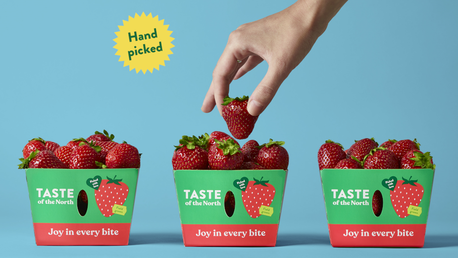
Pigeon Designs Fresh Identity for the Sustainable Quebec Brand Taste of the North
Taste of the North’s new brand positioning, identity and package design better aligns with the company’s identity: a punchy, youthful brand, looking for the best ways to offer American clients fresh and tasty produce from Québec. Jean Francois Beliveau, creative director at Pigeon Brands says: “We developed the brand strategy around the Taste of the North’s brand promise that delivers regionally-sourced produce grown the right way – resulting in exceptional taste. This translated into the consumer truth of experiencing delicious, flavourful produce – which was the driving point of differentiation and insight leading us to develop the tagline ‘joy in every bite!’. We continued the branding exercise developing brand guidelines to aid the brand’s truth coming to life with further extensions, which informed the package design we developed. Our design solution communicates freshness, flavour and the brand’s sustainability practices. We updated the identity and packaging to reflect the new tagline and brand values of Taste of the North – ‘joy in every bite’. With a stronger emphasis on 'taste' in the logo, a more contemporary wordmark and a saturation of a fresher green on pack, the new look and feel truly speaks to the brand’s delicious offerings and sustainable values”.

